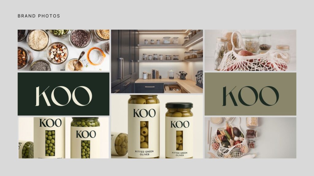
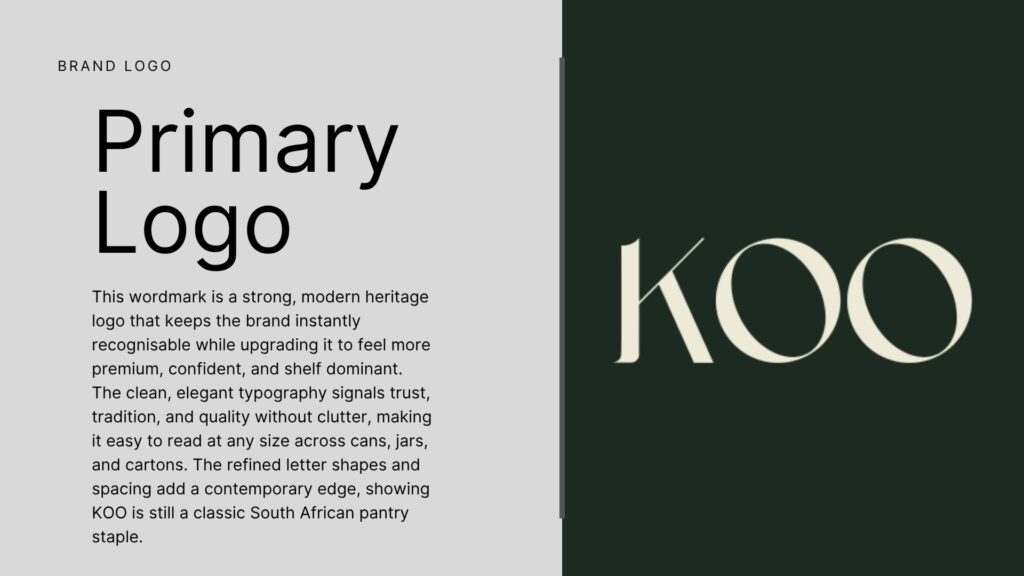
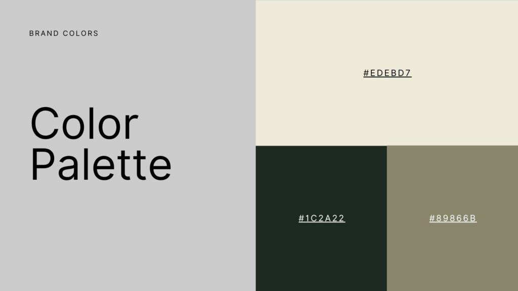
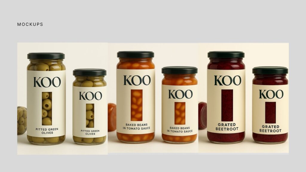
KOO was reimagined as a more premium, modern pantry brand while keeping its familiar and trusted identity intact. The concept blends heritage with contemporary elegance through refined typography, earthy tones, and clean packaging that feels more at home in today’s lifestyle-driven spaces.
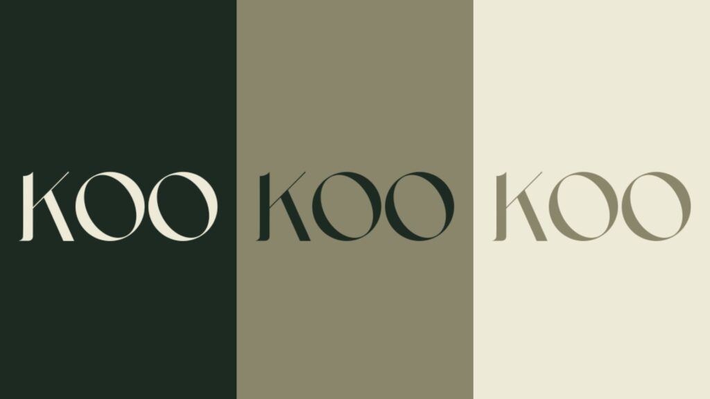
Gesiggie elevated the KOO brand by refining the logo, selecting a softer premium colour palette, building a more elegant typography system, and simplifying the packaging design for stronger shelf presence. Lifestyle imagery and realistic mockups were used to create a cohesive brand world that feels modern, warm, and visually distinctive.